Buildup
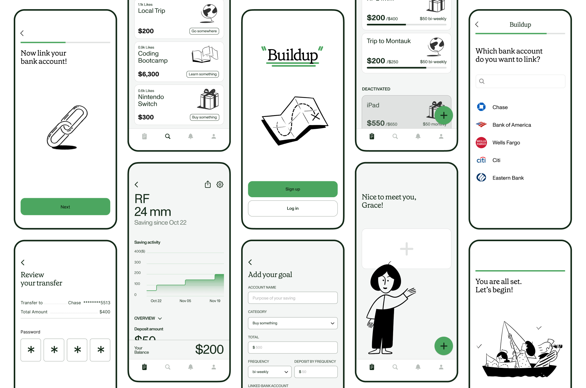
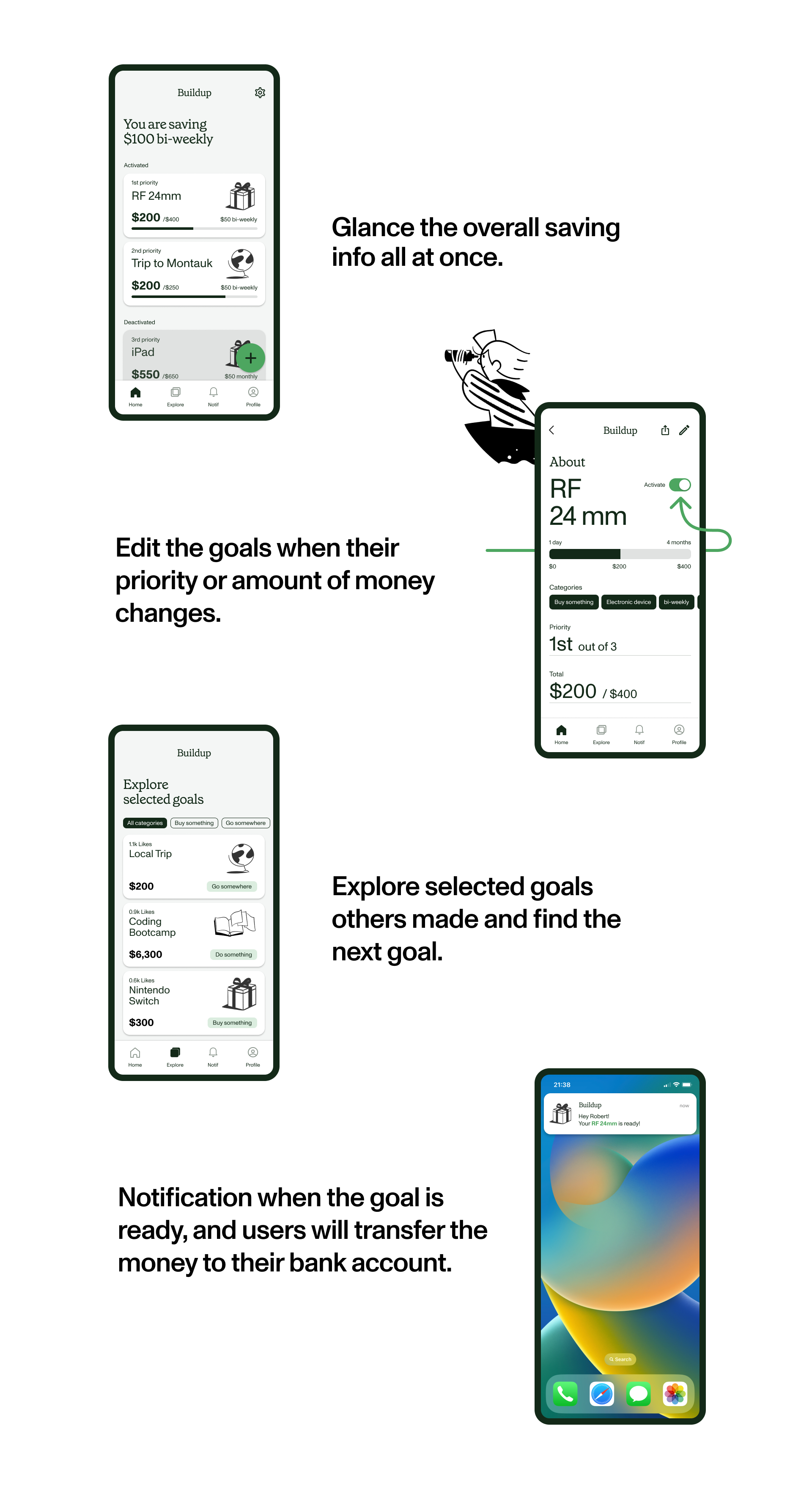
To assist users in budgeting for specific purposes, Buildup provides installment savings accounts categorized by their short-term goals, aiding them in effectively managing each one.
Problem
Young generations tend to invest in themselves,
but they often face budget constraints.
50% of Gen Z say they'll start investing themselves once the world returns to 'normal.' Due to the economic recession, they tend to spend money on short-term experiences they can engage in directly. ¹
1. https://www.yahoo.com/video/half-gen-z-see-no-100000808.html?guccounter=1
1. https://www.yahoo.com/video/half-gen-z-see-no-100000808.html?guccounter=1
However, the typical annual salary for Gen Z workers is about $32,500, which is considerably limited compared to other generations. It is not sufficient for them to do whatever they want without saving.²
2. https://www.gobankingrates.com/money/jobs/how-much-money-gen-z-makes-in-every-state/
2. https://www.gobankingrates.com/money/jobs/how-much-money-gen-z-makes-in-every-state/
Solution
Installment savings accounts designed for
specific goals that the user wants to achieve
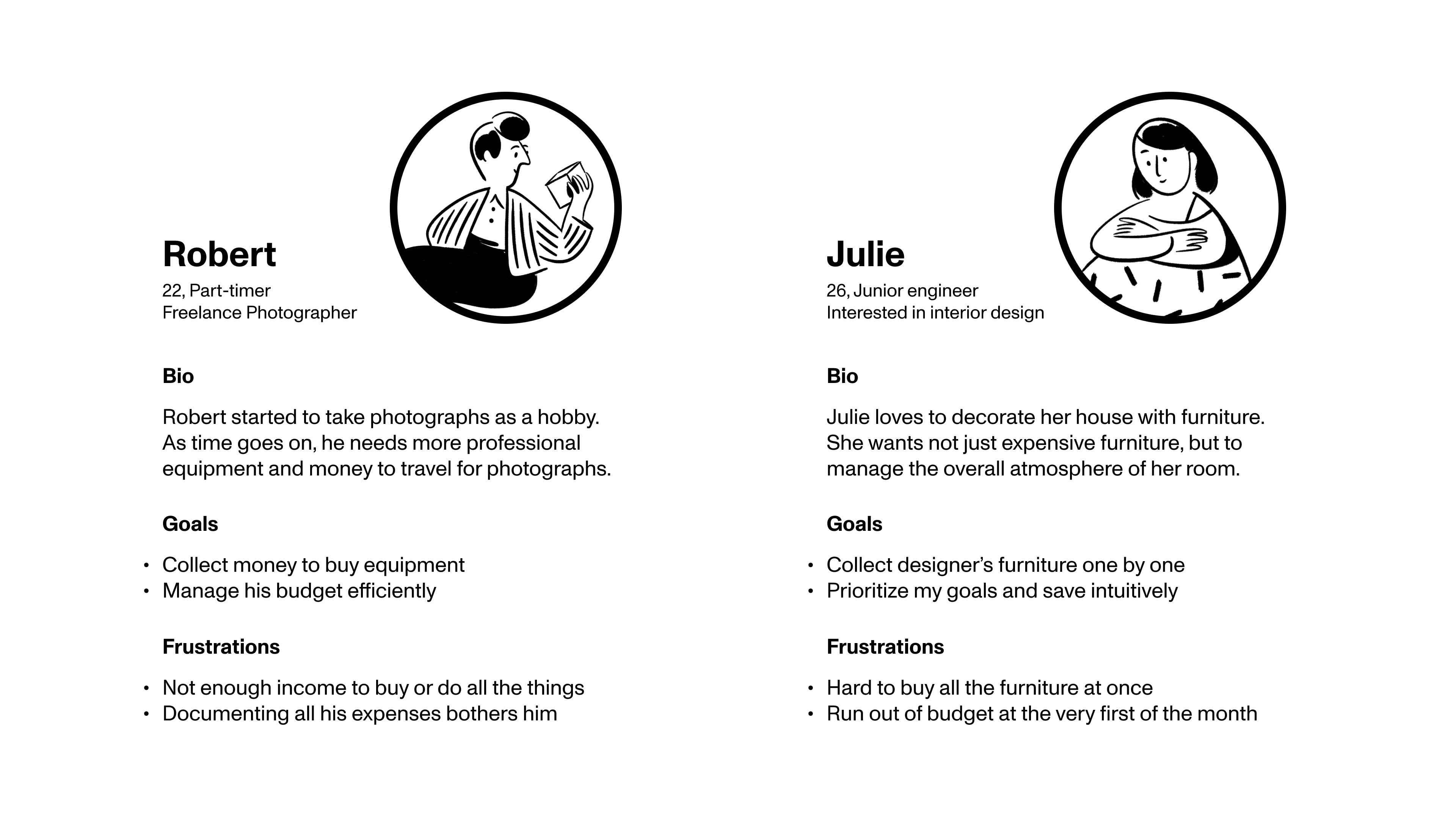
Hypothetical users
Key features
Prototype
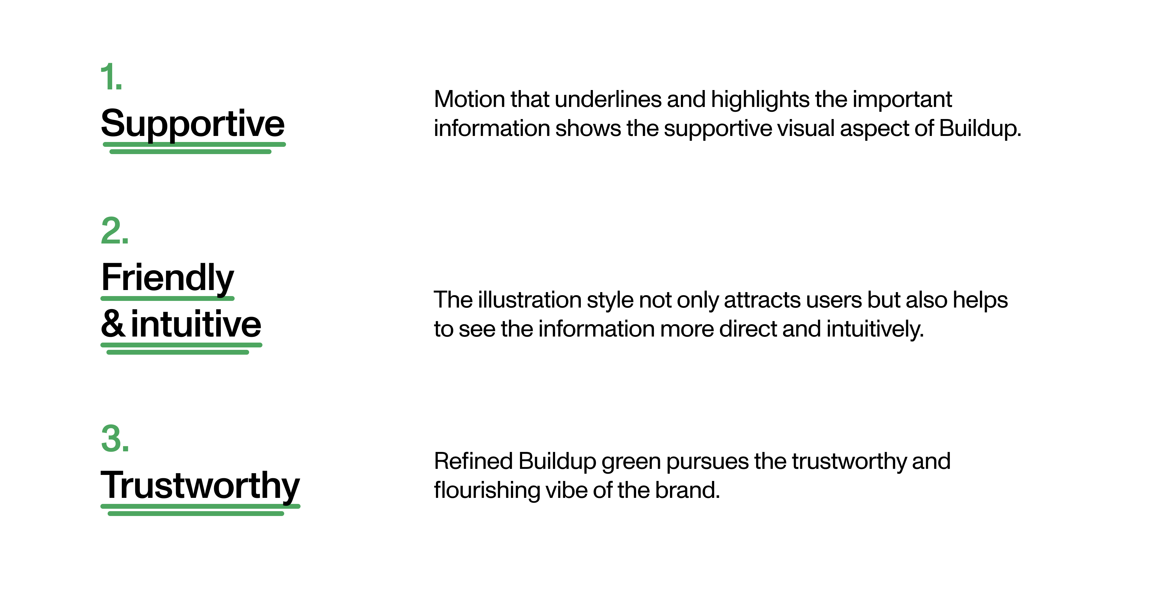
Design principles
Challenges
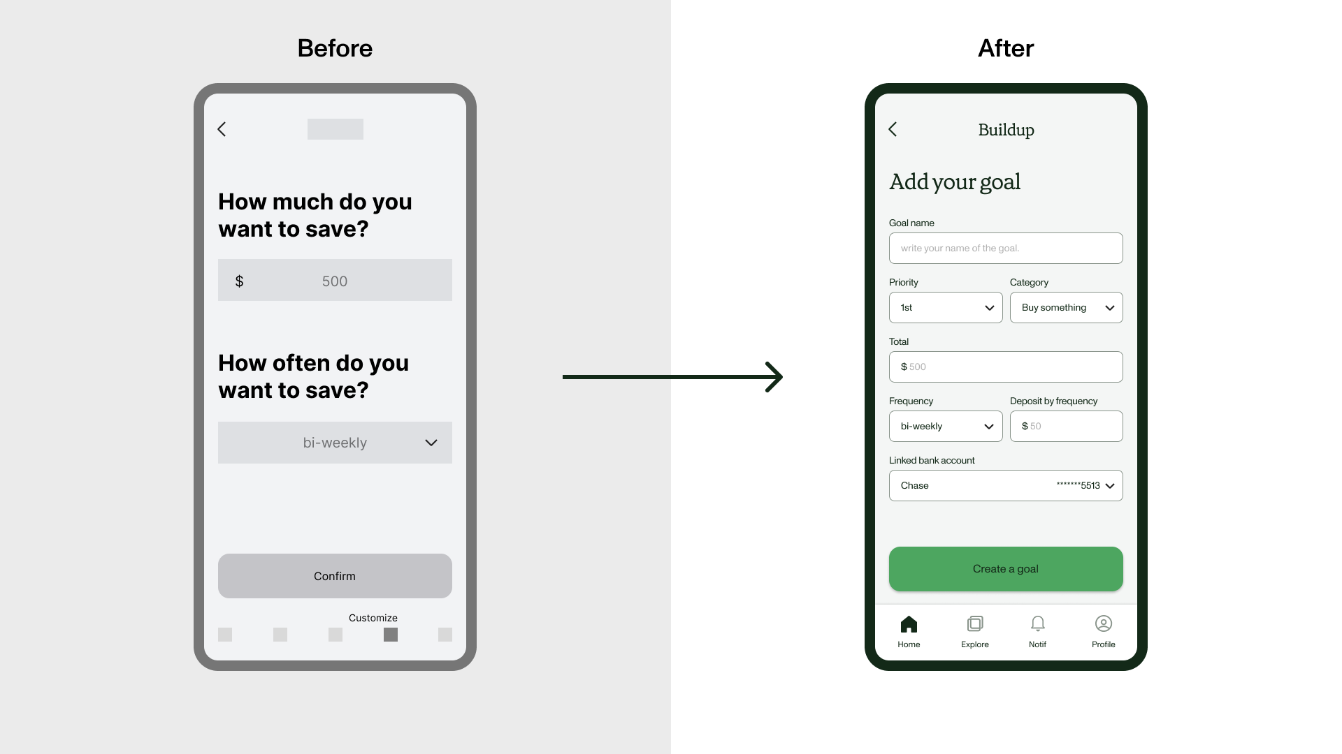
Challenge 01.
Avoid repetitive experience
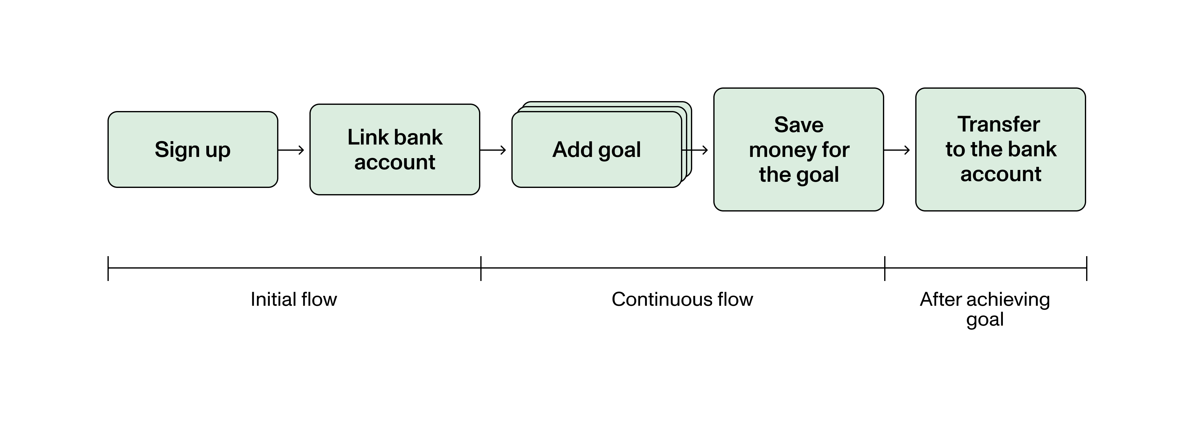
The initial approach was that users decide the whole amount of saving first. However, users need to do it again for specific goal later which is repetitive and confusing. To avoid this problem, I changed the flow to customize them only for the specific goal.
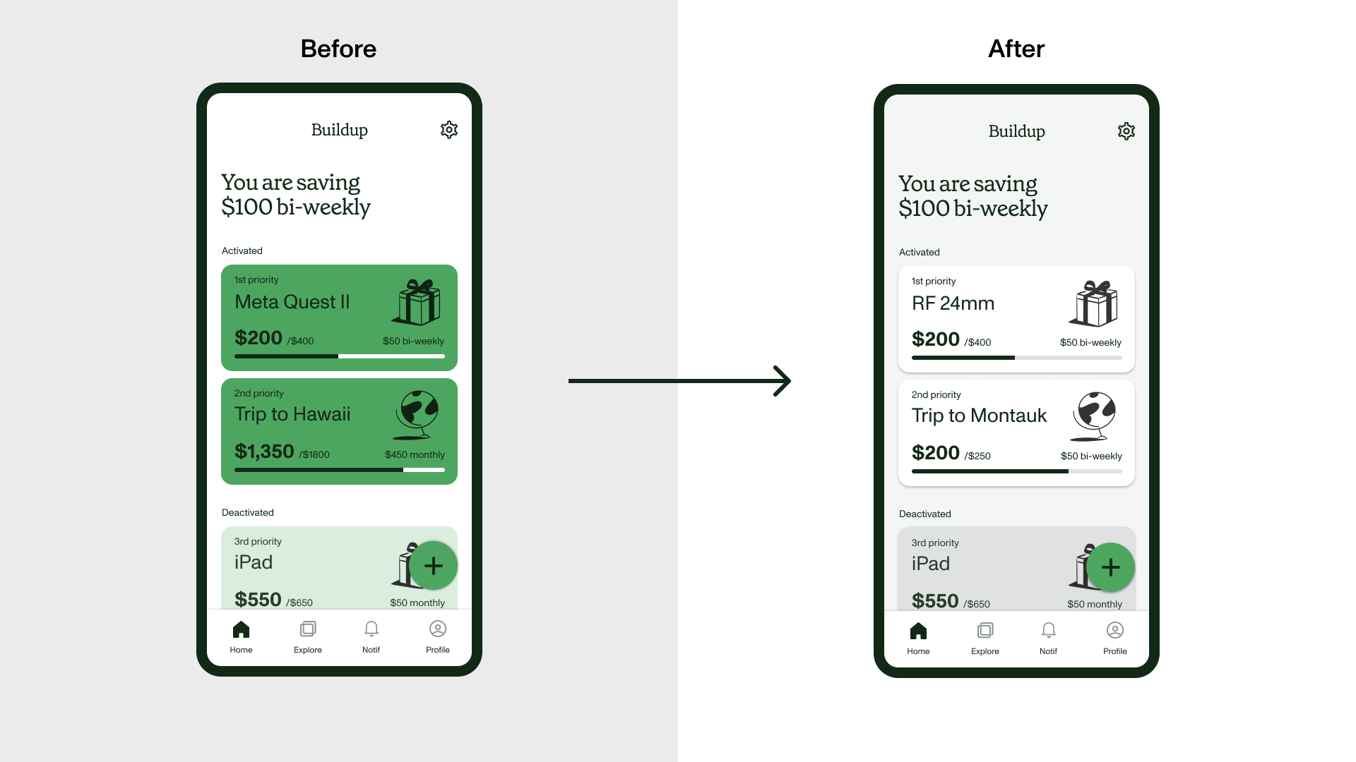
Challenge 02.
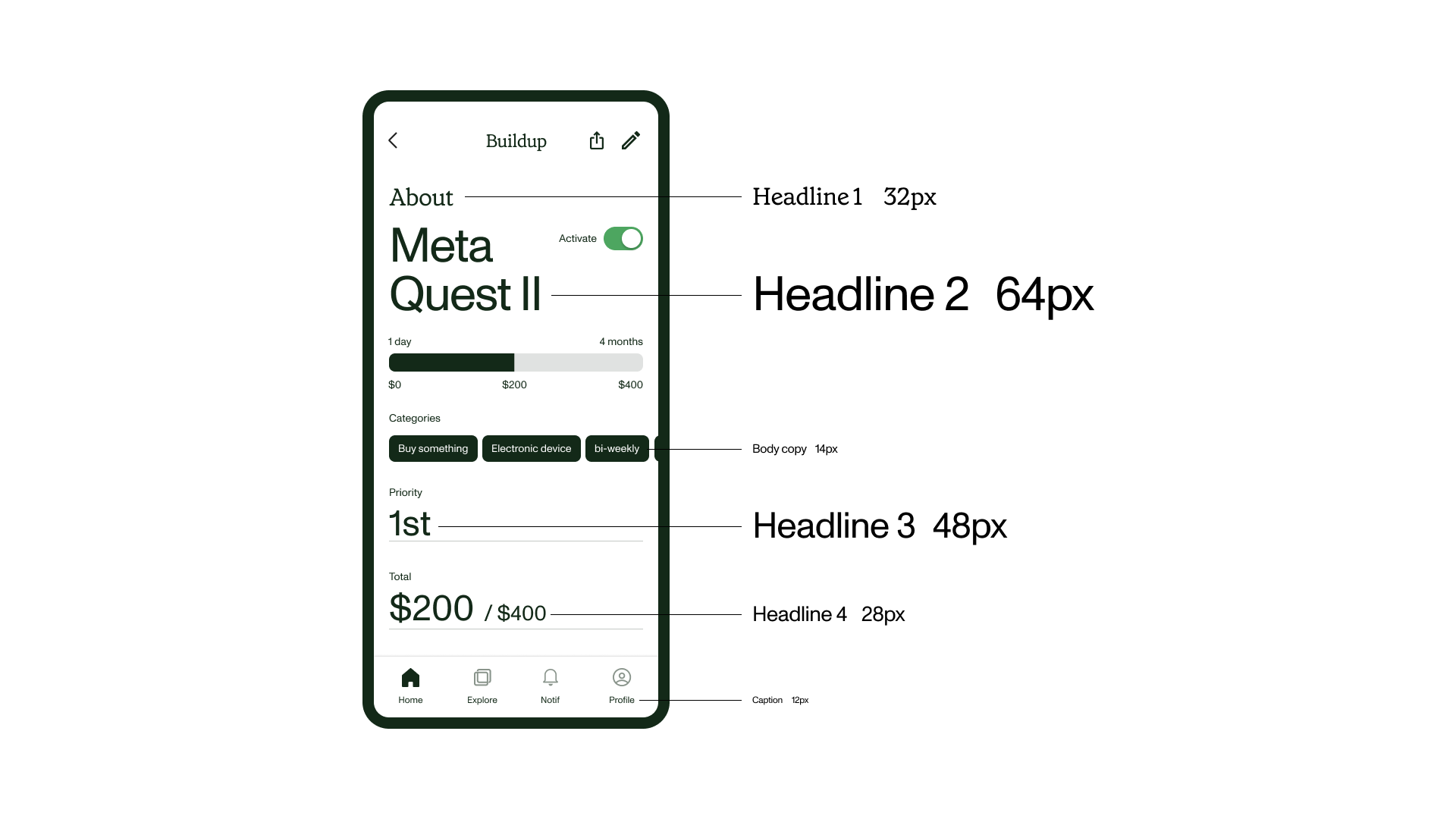
Use of key color
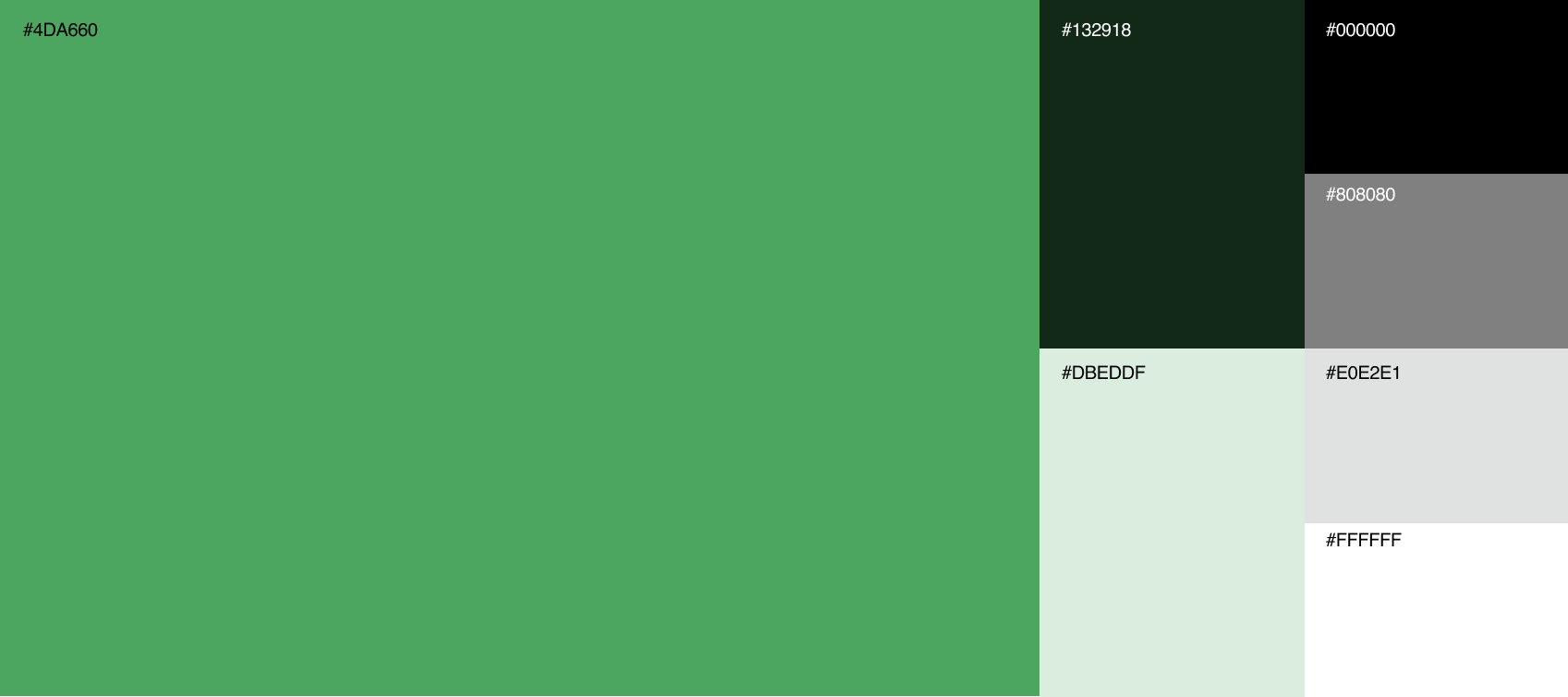
Although green is the key color of this product, users would confuse about what to click and what is not clickable on the screen. So I separated elements based on their function and restrained the key color on just one element on the screen.
Visual approach
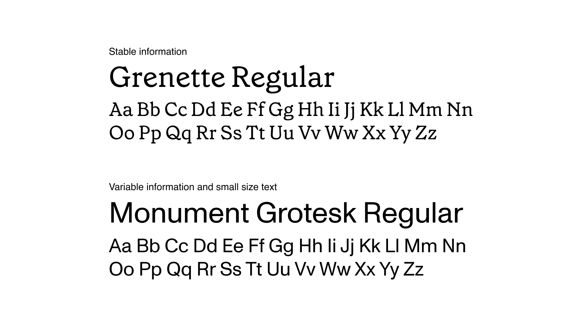
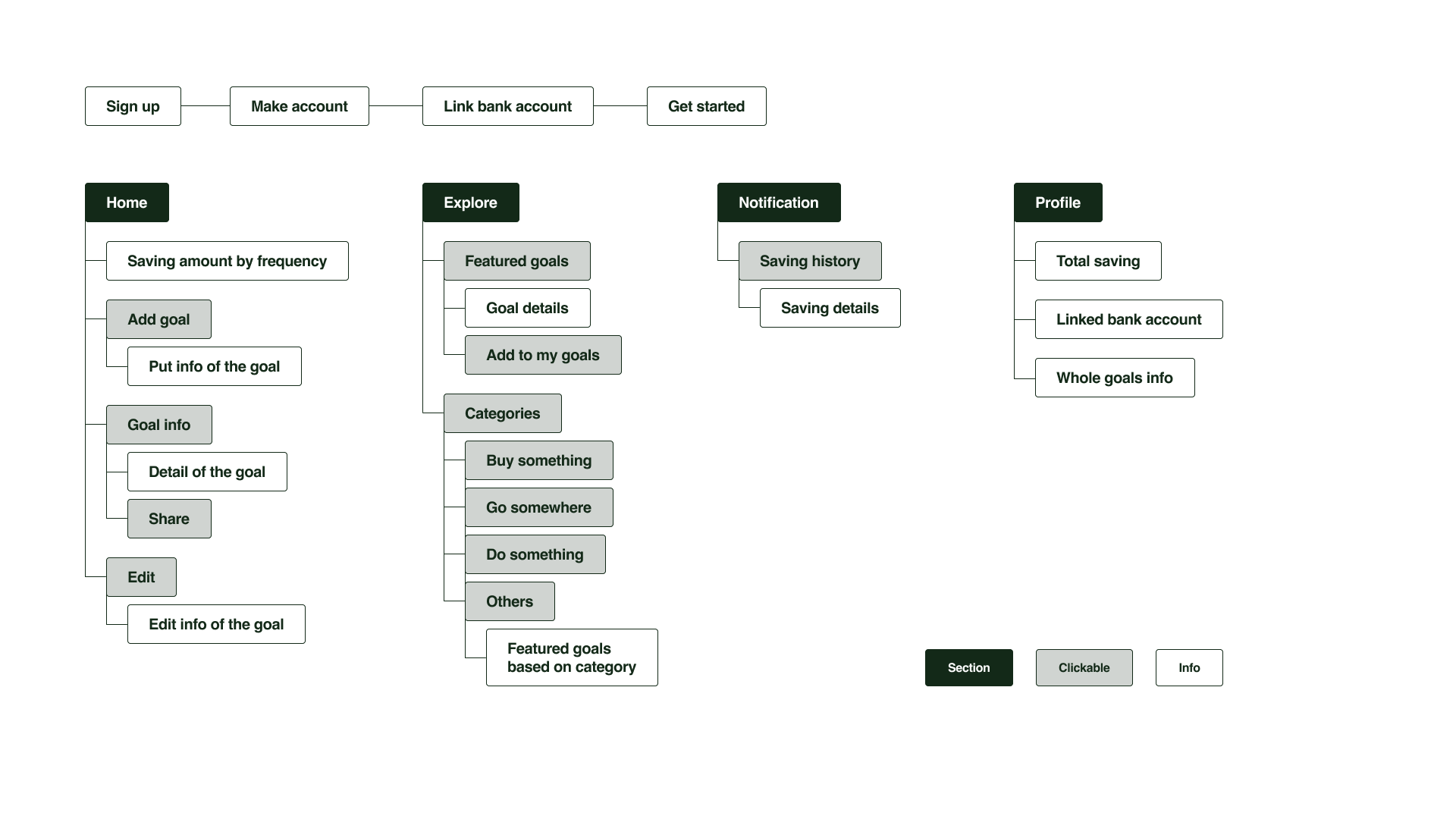
Userflow
& IA
& IA
What I’ve learned
Utilizing graphic element based on user experience
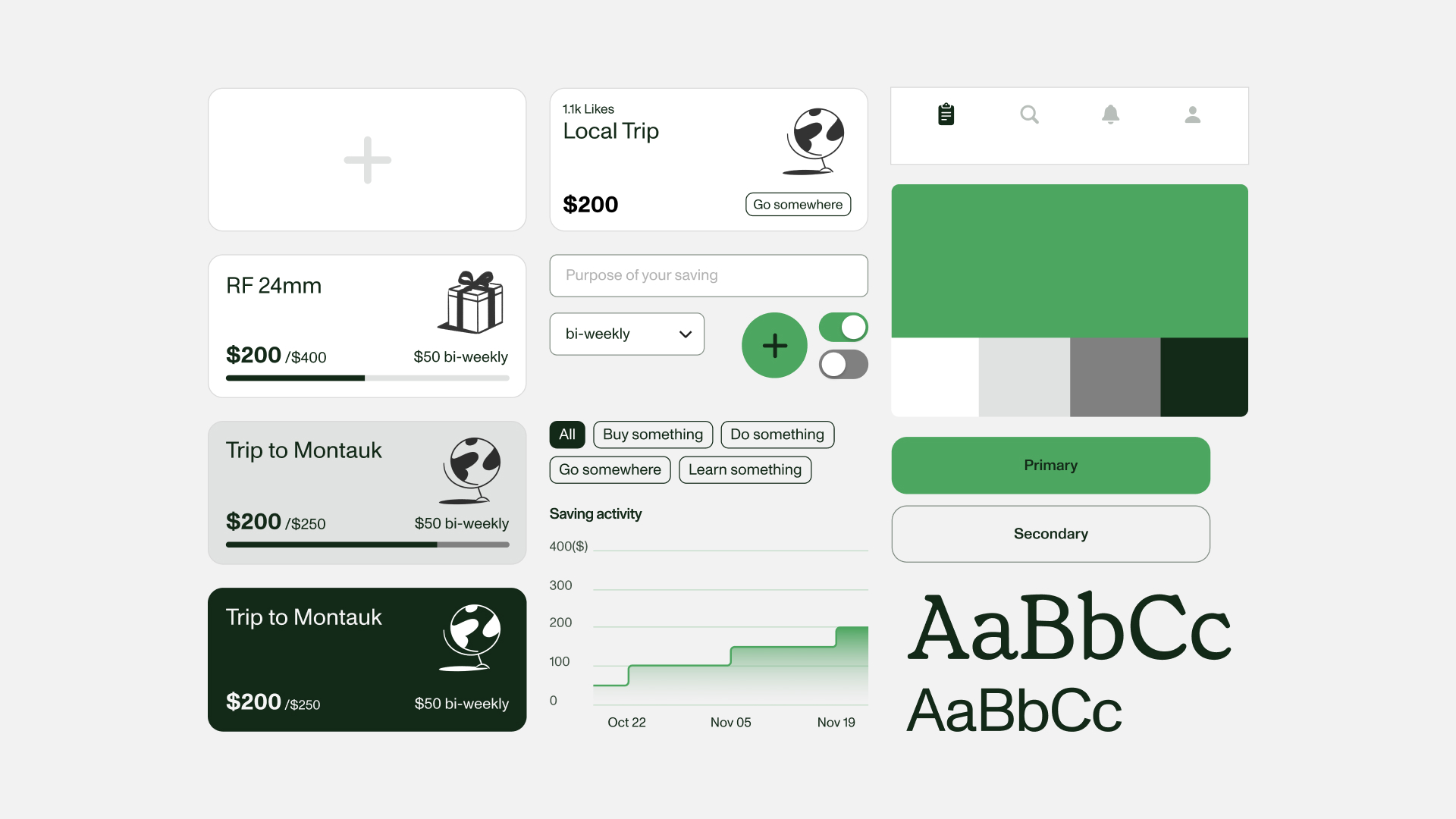
This project allowed me to consider the usage of design elements deeper in the mobile environment. I used cards not only to divide clearly from other goals, but also make it look clickable.
Prototyping whole flow step by step
I made prototypes for essential flows of Buildup and it helped me categorize each screen in more specific ways. I considered when the phase ends and the next phase starts. I add illustration-dominated screens in the middle of the flow to make it clear they are in a right way.
