Spreetz
Mobile product design, identity
Spreetz is an app designed for street artists to find opportunities for their artwork and easily showcase it to the audience.

Background
Street artists encounter difficulties in discovering accessible walls for their artwork and showcasing their creations to the public.
How can we enhance the
experience for street artists?
Spreetz supports street artists in finding opportunities for their artwork and showcasing their work to the audience.
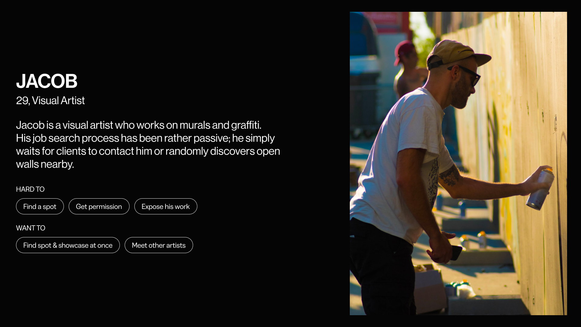
Who is going to use it?
How it works?
Find Wall
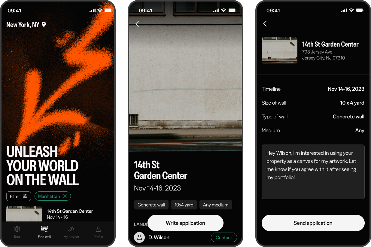
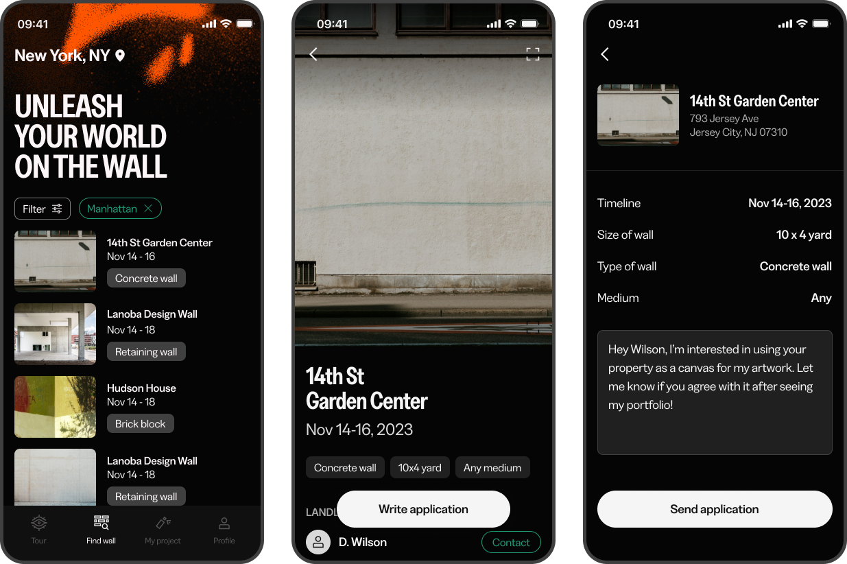
Jacob will explore open walls nearby and get matched with the land owner along with his portfolio.
Jacob will explore open walls nearby and get matched with the land owner along with his portfolio.
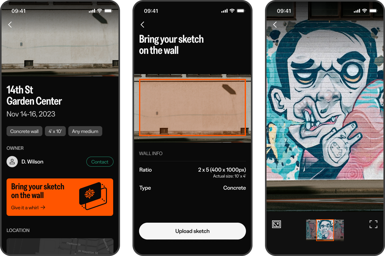
Support WIP 01.
Sketch mockup
After getting matched with a wall, Jacob could mock up a couple of sketches before beginning work on the project.
Sketch mockup
After getting matched with a wall, Jacob could mock up a couple of sketches before beginning work on the project.
Support WIP 02.
Live streaming
Live-streaming allowed him to cultivate a deeper interest in his project among the audience by showcasing its progress and interacting with them in person.
Live streaming
Live-streaming allowed him to cultivate a deeper interest in his project among the audience by showcasing its progress and interacting with them in person.
Artwork Tour
After uploading his work, Jacob could view not only his own but also others' artworks on the 'Tour' tab.
After uploading his work, Jacob could view not only his own but also others' artworks on the 'Tour' tab.
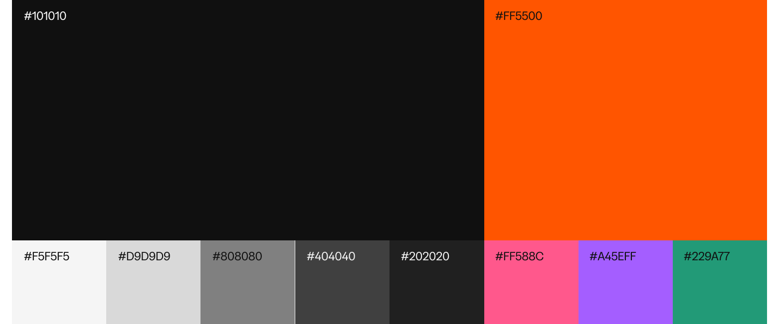
Visual
Approach

Typography

Iconography
Color
Experience
Approach
Pain points
(Based on second hand research & artist interview)
(Based on second hand research & artist interview)
Lack of information on available open walls.
Difficulty in connecting with property owners to obtain permission.
Disjointed experience in showcasing their work to the public.
Consideration
Match artists with owners.
Provide a seamless experience from discovering a spot to showcasing their work.
Assist artists throughout the project by offering sketch mockups and live streaming support.
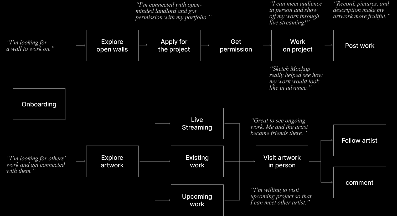
User
Journey
Journey
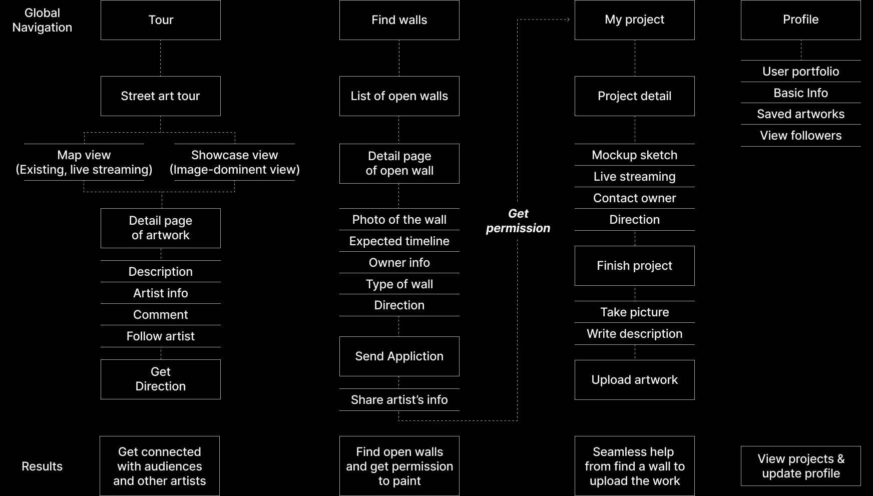
Information
architecture
architecture
Competitive
research
Current street art services emphasize only showcasing existing artworks, while Spreetz seeks to create an more interactive platform connecting clients, artists, and audiences.
research
Current street art services emphasize only showcasing existing artworks, while Spreetz seeks to create an more interactive platform connecting clients, artists, and audiences.

Experience
principles
principles

Refinement
from user testing
01. Dashboard
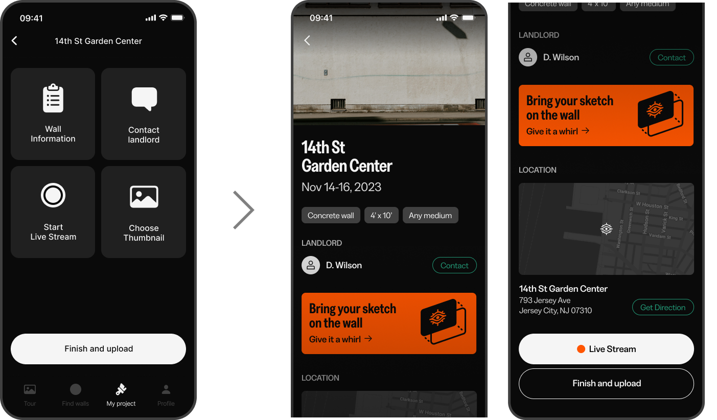
I've aligned my project tab with others, ensuring consistency in color, size, and UI elements for a clear functional hierarchy.
from user testing
01. Dashboard
I've aligned my project tab with others, ensuring consistency in color, size, and UI elements for a clear functional hierarchy.
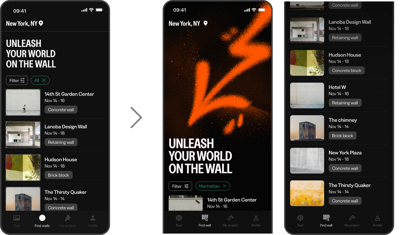
02. Find walls
Screen have ample white space and spray painted visuals, creating curiosity before they encounter the list.
Screen have ample white space and spray painted visuals, creating curiosity before they encounter the list.
